


Conflicting Signals From Housing Markets
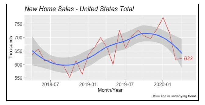
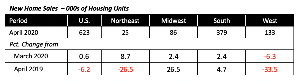
Last week’s housing report showed that sales of existing homes fell in April by just under 18% and new housing construction was down 30% from the prior month, But this week shows that sales of new homes actually rose modestly in April. For the month, sales of new homes increased by 0.6% over March to an annual rate of 623,000 units, although, compared to April 2019, sales were 6% lower.
Why are sales of new homes running counter the other two segments, that is, sales of existing homes and housing starts? This is the $64,000 question. But in the current pandemic environment, health-conscious potential home buyers may feel safer viewing, and moving to, a newly built home rather than to one that has been previously occupied.
Also, there are more new homes for sale relative to their current sales volume, than existing homes. That is, there is a larger inventory of new homes — 6.3 months’ supply — compared to existing homes, which currently have a four-month supply.
Further, while the average price of an existing home is up 5.4% over the last year, the average for a new home is down by 5.4%. This has shrunk the price gap between new and existing homes. Less than two years ago, new homes were on average 30% more expensive than existing homes, but by April the gap had fallen to just 13%.
Three of the four U.S. regions contributed to the national increase in new-home sales. The only exception is the West, where sales were down 6.3% in April, to an annual rate of 133,000 units.
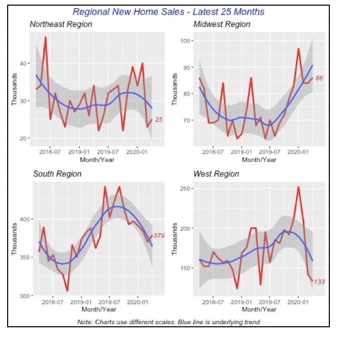
The biggest increase in percentage terms was in the Northeast, which posted an 8.7% jump from March sales. However, this region accounts for only 4% of new houses built in the U.S.
Sales in the South and the Midwest rose by an identical 2.4%, to 379,000 and 86,000 units each, respectively. The South, as reported, is the largest segment of the new-housing market, and accounted for 61% of total U.S. new-home sales in April.
Fewer Unemployment Claims, but No Major Improvement
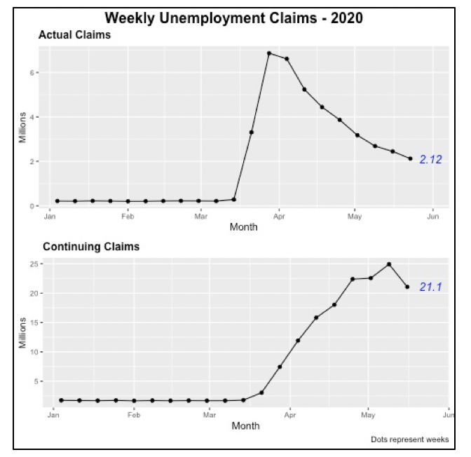
Week after week since the government issued stay-at-home orders in mid-March, more people have lost their jobs and applied for unemployment benefits. Although there was an improvement last week, when 323,000 fewer people filed than the prior week, a numbing 2.12 million persons still filed in the week.
But those receiving benefits as of two weeks ago fell to 21.1 million from nearly 25 million the week before. It’s important to note that unemployment benefits are managed by the states, and not the Federal government, and that responses and regulations vary among states. For instance, the length of time when people are covered varies by state, although the norm for most is 26 weeks. But in several states the coverage is for less time; such as Florida, where unemployment benefits coverage is for 12 weeks, although the CARES act extends that for another 13 weeks.
Further, not everyone applying for unemployment benefits is assured of getting them. In many instances, their application is not successful, and benefits are denied for any number of reasons. The main one is that they simply do not qualify because they don’t meet the criteria.
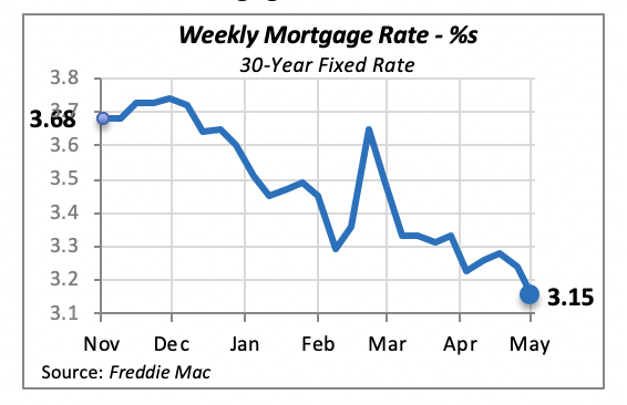
Mortgage Rates down modestly
The 30-year fixed mortgage rate hit a new historical low, falling 9 basis points to 3.15% last week; in fact, this is the lowest rate for fixed mortgages since the weekly data has been recorded back nearly 50 years ago. Six times since the current crisis began, mortgage rates have hit a record low; the latest low point prior to this year was in November 2012, when the Federal Reserve Bank engaged in another round of the so-called “Quantitative Easing” moves.
One achievement of the push toward lower rates is an increase in refinancing by homeowners, which has helped improved their balance sheets.
Manuel Gutierrez, Consulting Economist to NKBA
Explanation of NKBA’s Economic Indicators Dashboard
The dashboard displays the latest value of each economic indicator with a colored triangle that highlights visually the recent trend for each of the drivers. “Green” is a positive signal, indicating that the latest value is improving; “Yellow,” as it’s commonly understood, denotes caution because the variable may be changing direction; “Red” indicates that the variable in question is declining, both in its current value and in relation to the recent past.
Note that all the data, except for “mortgage rate” and “appliance-store sales” are seasonally adjusted and are represented at annual rates.
Remodeling Expenditures. This is the amount of money spent on home improvement projects during the month in question. It covers all work done for privately owned homes (excludes rentals, etc.). The data are in billions of dollars and are issued monthly by the U.S. Department of Commerce.
Single-Family Starts. This is the number of single-family houses for which construction was started in the given month. The data are in thousands of houses and are issued monthly by the U.S. Department of Commerce.
Existing-Home Sales. These data are issued monthly by the National Association of Realtors and capture the number of existing homes that were sold in the previous month.
High-End Home Sales. This series are sales of new homes priced at $500,000 and higher. The data are released quarterly by the U.S. Department of Commerce and are not seasonally adjusted. Thus, a valid comparison is made to the same quarter of prior year.
Mortgage Rate. We have chosen the rate on 30-year conventional loans that is issued by the Federal Home Loan Mortgage Corporation (known popularly as Freddie Mac.) Although there are a large number of mortgage instruments available to consumers, this one is still the most commonly used.
Employees in Residential Remodeling. This indicator denotes the number of individuals employed in construction firms that do mostly residential remodeling work.
Building-Materials Sales. These data, released monthly by the Department of Commerce, capture total sales of building materials, regardless of whether consumers or contractors purchased them. However, we should caution that the data also includes sales to projects other than residential houses.
Appliance-Store Sales. This driver captures the monthly sales of stores that sell mostly household appliances; the data are stated at an annual rate. We should not confuse this driver with total appliance sales, since they are sold by other types of stores such as home centers.
We hope you find this dashboard useful as a general guide to the state of our industry. Please contact us at Feedback@nkba.org if you would like to see further detail.


