

U.S. Trade Falls in March; Employment Collapses in April
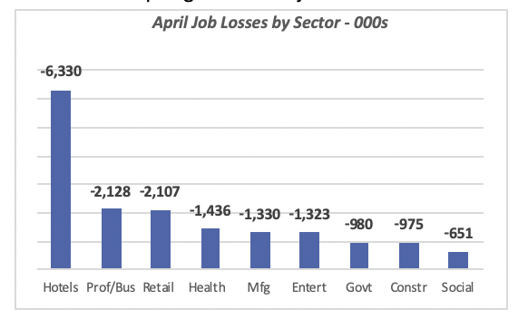
The official employment report for April came out with the grim news that has been well-documented: huge job losses and distress throughout the economy. Overall, total employment fell by 20.5 million workers in April, which, when added to the reported loss of 870,000 in March, brings the total official number of jobs lost in the wake of the pandemic lockdown to 21.4 million.
The biggest losses were suffered in the Hospitality industry (labeled “Hotels” in the chart), which lost over 6,000 jobs in April, followed by Professional/Business Services and Retail, each of which lost more than 2,000 jobs.
Closer to the K&B industry, Construction lost nearly 1 million jobs for the month, but when combined with 33,000 jobs that vanished in March, the total surpasses a million jobs lost by the construction industry since the lockdowns began.
Note that the 980,000 reduction in government jobs was not at the Federal level, but state and local governments; furthermore, local governments, i.e. cities or smaller units, accounted for 80% of the drop in government jobs.
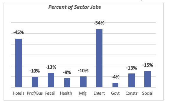
Relative to the level of employment in February, when employment hit 152 million jobs, one of seven jobs (14%) have been lost due to the forced quarantine and other actions taken by Federal and State governments.
The biggest losers are the Hospitality and Entertainment industries, both of which have seen their employment levels drop by around half. The biggest one is Entertainment, where 54% of the jobs disappeared in April. But Hospitality businesses have also lost a sizable number of employees, having reduced their staff by 45% in April alone.
Most other industries have seen the number of jobs reduced by around 10%.
The Difference Between Number of Jobs Lost and Unemployment Claims
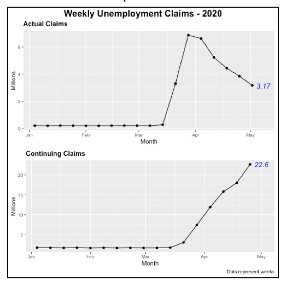
Last week, another 3.17 million people applied for unemployment benefits, bringing the total who have filed since mid-March to 33.5 million. At the same time, the official number of unemployed people is 23.1 million. So the question arises of why there is such a large discrepancy between these figures.
The number of claims represents the number of persons who have lost their jobs and have applied for benefits. However, for some, the government may deny benefits for a number of reasons. Also, many of them may not be actively looking for work. In order be classified as “unemployed,” instead of someone who is not part of the workforce (such as a stay-at-home spouse with no outside employment) a person must actively be looking for a job.
A final source of discrepancy is that the employment data are collected in the first two weeks of the month. Thus, it does not capture any layoffs as shown by the unemployment claims data for the last two weeks in April.
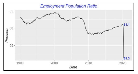
Another measurement, one that gives a different perspective on the employment situation, is the “employment-to-population” ratio. This is simply the total working-age population divided by the number of persons who have a job.
Since February, when 61.1% of the population were employed, the ratio has fallen by nearly 10 percentage points to 51.3% — just over half of the U.S. population is currently working. This is by far the lowest ratio since these data began to be collected back in 1948. In fact, that low point was reached in 1949, when the ratio fell to 54.9%.
Employment in the K&B Industry
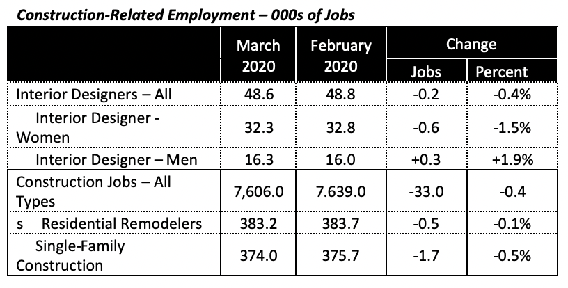
Data for several areas within the K&B industry are only available one month behind; that is, the latest data posted is for March. Nonetheless, the table below displays several statistics that maybe of interest, including that interior designer jobs have been fairly stable from February to March, but that construction jobs fell, although by a half percentage point or less.
U.S. Imports and Exports Each Fall
On top of the trade disputes engaged by the government over the last year or so, which had caused a stall in foreign trade, the pandemic drove both U.S. imports and exports down in March.
Even though both fell, the 10% drop in exports to $188 billion in March was greater than the 6% decline in imports to $232 billion. This resulted in a worsening of the trade balance to $44.4 billion, which matches the average since 2010. This can be seen in the bottom graph of the chart below.
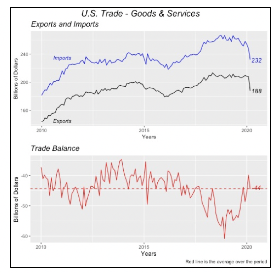
Given the virtual closing of most world economies in April, economists expect to see a more dramatic decline when data for that month is available in June.
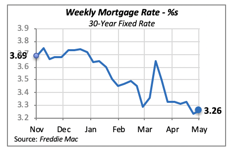
Mortgage Rates Edge Higher
Although mortgage rates remain very favorable toward home purchases, it is not expected that they would compensate for the reluctance of many consumers to explore buying a home. Anecdotal data suggests fewer buyers are actively in the market, many are postponing a home purchase for a few months. It is a question of time whether they will in fact return when the crisis is over.
Manuel Gutierrez, Consulting Economist to NKBA
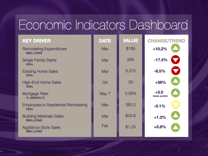
Explanation of NKBA’s Economic Indicators Dashboard
The dashboard displays the latest value of each economic indicator with a colored triangle that highlights visually the recent trend for each of the drivers. “Green” is a positive signal, indicating that the latest value is improving; “Yellow,” as it’s commonly understood, denotes caution because the variable may be changing direction; “Red” indicates that the variable in question is declining, both in its current value and in relation to the recent past.
Note that all the data, except for “mortgage rate” and “appliance-store sales” are seasonally adjusted and are represented at annual rates.
Remodeling Expenditures. This is the amount of money spent on home improvement projects during the month in question. It covers all work done for privately owned homes (excludes rentals, etc.). The data are in billions of dollars and are issued monthly by the U.S. Department of Commerce.
Single-Family Starts. This is the number of single-family houses for which construction was started in the given month. The data are in thousands of houses and are issued monthly by the U.S. Department of Commerce.
Existing-Home Sales. These data are issued monthly by the National Association of Realtors and capture the number of existing homes that were sold in the previous month.
High-End Home Sales. This series are sales of new homes priced at $500,000 and higher. The data are released quarterly by the U.S. Department of Commerce and are not seasonally adjusted. Thus, a valid comparison is made to the same quarter of prior year.
Mortgage Rate. We have chosen the rate on 30-year conventional loans that is issued by the Federal Home Loan Mortgage Corporation (known popularly as Freddie Mac.) Although there are a large number of mortgage instruments available to consumers, this one is still the most commonly used.
Employees in Residential Remodeling. This indicator denotes the number of individuals employed in construction firms that do mostly residential remodeling work.
Building-Materials Sales. These data, released monthly by the Department of Commerce, capture total sales of building materials, regardless of whether consumers or contractors purchased them. However, we should caution that the data also includes sales to projects other than residential houses.
Appliance-Store Sales. This driver captures the monthly sales of stores that sell mostly household appliances; the data are stated at an annual rate. We should not confuse this driver with total appliance sales, since they are sold by other types of stores such as home centers.
We hope you find this dashboard useful as a general guide to the state of our industry. Please contact us at Feedback@nkba.org if you would like to see further detail.


