The Inverted Yield Curve: Recession Predictor?
The inverted yield curve has been in the news recently — here’s what it is and why it has apparently become so important.
Normally, interest rates on short-term loans are lower than on long-term ones. This is because the risk increases the longer it takes to repay the loan. A lender will take a higher return the longer the life of the loan, because there are more chances that something will go awry and the borrower may default on the loan.
Only in rare situations is the short-term rate higher than the long one — and the yield curve is inverted. This happens, for instance, when lenders feel that there is risk of a slowdown or even recession in the very near future, with the expectation is that in two or three years, the economy will improve. Then, lending for a short period may be riskier, so lenders will demand a higher return than if they were lending for a longer period of time.
This is illustrated in the chart below, showing the difference between a long-term loan, in this case a 10-year Treasury bill, and a short-term loan, which is a three-month Treasury bill, since 1962. Note that this is not the yield curve per se, but a way to visualizing the relationship that economists think is crucial about the “inverted yield curve.”
Points above the red line indicate that the long-term rate is higher than the short-term one; and conversely, points below the red line show that short-term rates are higher than long-term rates.
The interesting thing is that points below the red line precede recessions (highlighted by the gray bars) by several months. As the graph illustrates, the long/short difference fell below the red line seven times since 1962, and in six of those cases, the economy tumbled into recession soon after. The only case in which a recession did not follow the time of a yield curve inversion was around 1966.
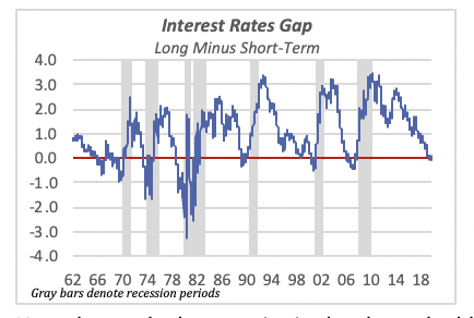
Note that at the latest point in the chart, the blue line falls in negative territory — barely. This is basically the reason why a lot of economists are talking recession. This suggests that a recession may occur in the next few months. However, nothing can be said to be “for sure” to happen in matters of the economy.
Housing Market Slips but Still Remains Stable
Overall housing starts fell in July for the third time since April, to an annualized rate of 1.19 million units, although this time, the cause was a sharp 16% drop in multifamily starts, while single-family starts actually rose by 3.4%.
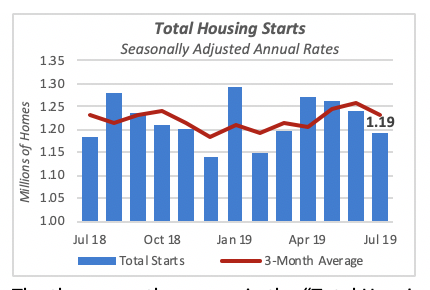
The three-month average in the “Total Housing Starts” chart above highlights the fact that the housing market has remained relatively stable, within a range of about 1.2 million and 1.25 million units annually, for at least the last year.
Despite favorable mortgage rates, which have been at their lowest historical levels for the last half century, and essentially full employment with wages rising, consumers are not purchasing homes at the rates one would expect. Year-to-date through July, a total of 730,000 houses have been started; this is 22,000 fewer than the same period last year, when 754,000 were started.
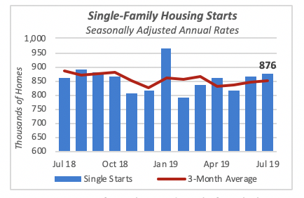
Construction of single- and multifamily housing units has also fluctuated within a narrow band, neither one showing a positive or negative trend.
Single-family starts, shown in the chart above, rose 3.4% last month to an annual rate of 876,000 units. Although it has increased the last couple of months, in reality, it has been a roller-coaster ride, rising and falling every three months or so.
So far this year, 516,000 single-family houses were started, compared to 534,000 last year.
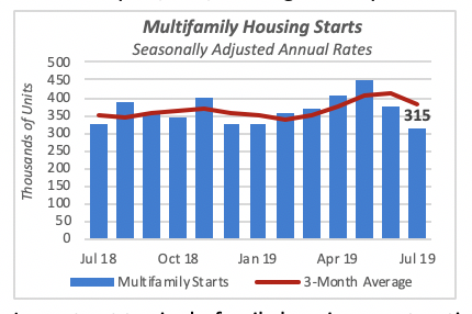
In contrast to single-family housing construction, multifamily housing units have declined the last two months, to a rate of 315,000 units in July. Multifamily housing starts have declined 16% in each of the last two months, virtually returning to the pace of construction seen at the beginning of the year.
Similar to the single-family sector, year-to-date construction of multifamily housing units is lower than last year’s. This year has seen construction of 214,000 multifamily units, slightly lower than the 220,000 units that were started in 2018.
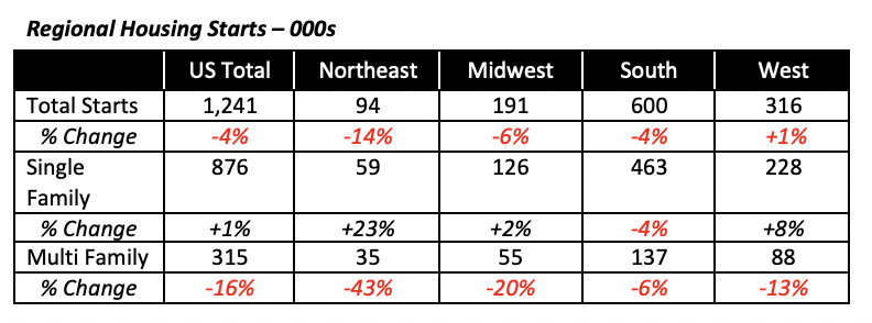
Regionally, as the table, shows, all four regions contributed to the decline in multifamily construction, while only the South region saw both single- and multifamily sectors fall.
Retail Sales Gain
In good-news territory, the Commerce Department released retail sales data for July, which showed a favorable 0.7% gain over the prior month. This is the fifth consecutive month of increases in the retail sector — they help offset declines in manufacturing over the last year or so. In fact, the modest increases in retail sales should boost the manufacturing sector, unless manufacturing inventories are at high levels. In the latter case, manufacturers can simply deplete their inventories without have to increase production.
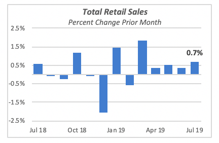
Compared to last year, total retail sales are up 3.4%. This is just slightly higher than it was in June, when sales were 3.3% above June 2018.
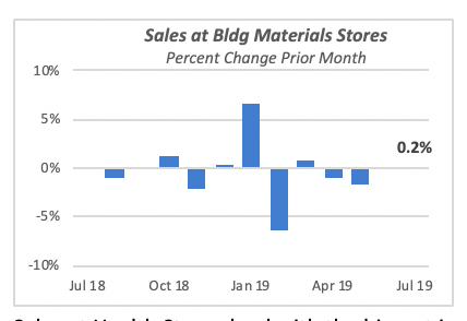
But for a sector of our interest, sales of Building Materials and Equipment, sales rose only 0.2%. For all practical purposes, these sales have been flat the last two months, following declines in the previous two months. Despite this gain, sales are still running 2.9% below last year.
Sales at Health Stores lead with the biggest improvement over last year, up 4.3%. But they only represent 6% of total retail sales.
The largest component of the retail sector, sales of Vehicles and Parts, which represent one in five sales dollars, actually fell by 0.6% in July. However, they are 2.3% ahead of last year.
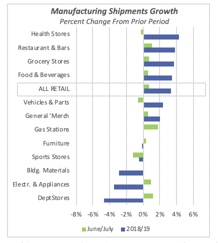
Building Materials and Equipment are also a relatively small component of the total; currently, they account for 6% of all sales.
Mortgage Rates Remain Unchanged
Following the Federal Reserve Bank’s announcement at the end of July that it was dropping interest rates by a quarter percentage point, the 30-year fixed mortgage rate fell by 15 basis points to 3.6%. The rate remained there last week.
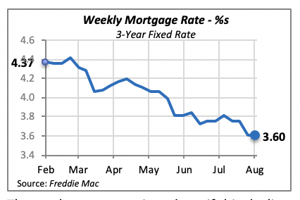
The markets must wait and see if this decline will invigorate the housing sector, although the decline over the last six months, clearly seen in the chart above, has not produced any significant improvement in housing starts or home sales.
Manuel Gutierrez, Consulting Economist to NKBA
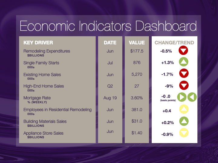
Explanation of NKBA’s Economic Indicators Dashboard
The dashboard displays the latest value of each economic indicator with a colored triangle that highlights visually the recent trend for each of the drivers. “Green” is a positive signal, indicating that the latest value is improving; “Yellow,” as it’s commonly understood, denotes caution because the variable may be changing direction; “Red” indicates that the variable in question is declining, both in its current value and in relation to the recent past.
Note that all the data, except for “mortgage rate” and “appliance-store sales” are seasonally adjusted and are represented at annual rates.
Remodeling Expenditures. This is the amount of money spent on home improvement projects during the month in question. It covers all work done for privately owned homes (excludes rentals, etc.). The data are in billions of dollars and are issued monthly by the U.S. Department of Commerce.
Single-Family Starts. This is the number of single-family houses for which construction was started in the given month. The data are in thousands of houses and are issued monthly by the U.S. Department of Commerce.
Existing-Home Sales. These data are issued monthly by the National Association of Realtors and capture the number of existing homes that were sold in the previous month.
High-End Home Sales. This series are sales of new homes priced at $500,000 and higher. The data are released quarterly by the U.S. Department of Commerce and are not seasonally adjusted. Thus, a valid comparison is made to the same quarter of prior year.
Mortgage Rate. We have chosen the rate on 30-year conventional loans that is issued by the Federal Home Loan Mortgage Corporation (known popularly as Freddie Mac.) Although there are a large number of mortgage instruments available to consumers, this one is still the most commonly used.
Employees in Residential Remodeling. This indicator denotes the number of individuals employed in construction firms that do mostly residential remodeling work.
Building-Materials Sales. These data, released monthly by the Department of Commerce, capture total sales of building materials, regardless of whether consumers or contractors purchased them. However, we should caution that the data also includes sales to projects other than residential houses.
Appliance-Store Sales.This driver captures the monthly sales of stores that sell mostly household appliances; the data are stated at an annual rate. We should not confuse this driver with total appliance sales, since they are sold by other types of stores such as home centers.
We hope you find this dashboard useful as a general guide to the state of our industry. Please contact us at Feedback@nkba.org if you would like to see further detail.


