SPONSORED CONTENT
Pfister offers some strategies for small but stylish living.
The tiny home trend isn’t going anywhere, and our fascination with all things beautifully functional is only ramping up. Go on any tiny homes tour and you’ll find standing-room-only in the kitchen and bath areas. This is where voyeurism is at its best, but it’s also where some serious thinking is going on. Could I live like this? Cook here? Shower there? How, exactly are these tiny homeowners making it work?
Go Global.
Making small spaces work harder has been done — and done well — in the most expensive European cities for decades. Not just in apartments, but boutique hotels, too. Start with the broadest perspective for your design, which means expanding your reference search beyond tiny homes in North America and thinking outside pre-curated photos. Scour hotel websites and flats for rent in London, Milan, Tokyo.
Dig through the memory bank.
You can also use your own memory to serve as a guide for places and spaces you’ve loved as a designer and ask those same questions of your clients. When we took an internal poll of favorite places we’d lived, it was amazing how many people had their fondest memories in not-so-spacious starter homes or shared apartments. One man remembered most reverently a galley kitchen with just enough room for two — and only when he pulled a step-stool out of the closet, sitting to drink wine from a jelly jar. Another woman said she’d always wanted to replicate the bathroom from a college apartment in Florence. The tiny room had tiled walls and the commode was actually part of the shower space. Outside the little window was her clothesline on a pulley.
Engage your creativity.
Notice how none of these memories invoke the word “spacious.” What makes them indelibly big is the sense of freedom. Scaling down and simplifying affords us the luxury of appreciating what’s right in front of us, which is a huge part of freedom. If it’s a relief to organize that third bedroom, imagine how it feels to nix it completely. That’s the sense of purpose and excitement that fuels the best designers. You’re doing the Sunday New York Times crossword puzzle: working vertically, then horizontally, tackling those gnarly, dense (kitchen and bath) areas first. Using one area to help fill in another, until it all comes together cohesively.
That cosmopolitan kitchen in a nutshell.
Just like chefs who create masterpieces with only a few ingredients, buying quality is key. Small, sleek appliances that are easy to keep clean take priority for your kitchen spend. Many overseas manufacturers are integrating color on coated surfaces. It’s an easy way to tie together a small space without adding clutter.

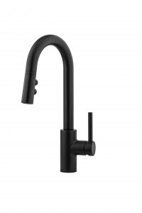
Your next priority is fixtures known for durability — without sacrificing design. Try a small-footprint faucet that makes a big splash and still stands up to some serious cooking. Going back to crossword-puzzle thinking, if horizontal space is tricky, go vertical: consider using a bar faucet. Many elegant, full-sized kitchen faucets are also available in a smaller scale bar faucet version, proportioned just right for tight spaces. The Stellen pull-down bar faucet from Pfister hits that mark just right.
Baths that are calm, cool and collected.
As with everything “tiny,” built-ins are key in the bathroom. Every square foot has to earn its keep. Fewer personal items on display means that faucets and fixtures work harder to reflect the owner’s personality. Engage that crossword horizontal-and-vertical thinking to maximize space for shower/tub, sink and commode, then build in as much storage for necessities (like towels) as possible. Think about a commode or sink in what’s typically a “shower” area. Can it make sense? Maybe so.

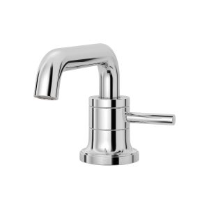
Next, choose a color palette that’s simple. Combined with good natural light, this will let you play with fixtures that really pop. Again, go for durability and high style. Single-control faucets, like the one from the Tenet collection by Pfister, are particularly good for maximizing space. The key is to choose well for the proportion of not only the sink, but the entire bath, as it’s all seen in a single glance. The money spent on these “showpiece” permanent elements will elevate little décor touches that are easily changeable. So, splurge on a design that checks all the boxes, beautifully.
Two rooms, one philosophy.
Once you’ve brainstormed and discussed and designed the kitchen and bath, the other rooms in that tiny house will come together more easily. Most of the heavy lifting, in terms of usage and storage, is done. Now the task is to keep the same level of simplicity in all areas of the home. Keep reminding yourself how little is actually needed to make memories that last a lifetime. You’re bringing someone’s tiny home-sweet-home vision to life.


